


London’s original schematic Underground diagram is often cited as an essential example of early modernist design: clear, to the point, reduced to relevant information. Geographic accuracy is secondary, sequences and connections are highlighted. It’s about structure, the map shows a network. It becomes a circuit diagram that helps us busy electrons buzz across the city. In this context it’s usually noted that Harry Beck, who designed this map, was not a designer by trade, but a draftsman for technical drawings.
Maxwell Roberts also makes schematic diagrams of transportation networks, and like Beck is also not primarily a designer. He is a psychologist and doesn’t only design these maps, but knows how to analyze them by means empirical testing. At Typo 2016 he speaks about his alternative designs for transportation network maps of cities across the globe and the different forms his maps take. He presents his experiments to put them to the test and through his studies reveals what might come as a shock to us designers – sometimes we are just not as right as we think we are.
 © Sebastian Weiß / Monotype
Misconceptions, Prejudices and Biases
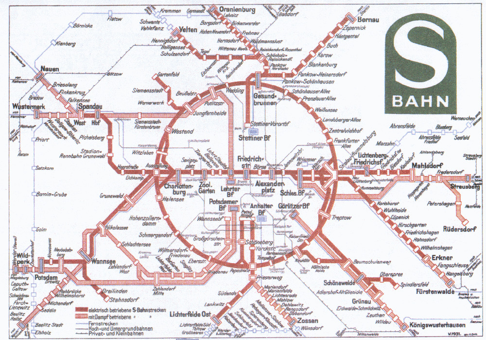
The first misconception he takes on should please the local audience: Beck’s 1933 map of London wasn’t actually first the schematic one, Berlin had one two years prior. (Although, and this is the designer speaking, London’s was prettier.) Beck’s map does establish a concept though, that is still in use today and can be found in the current maps of London as well as Berlin. It’s the concept of octolinearity. In order to provide structure all pictured train lines travel along 4 angles, and are thereby bound to eight directions: north, south, east and west, as well as north-east, south-east, etc. Schematic maps may range from tetralinear, with only two angles to decalinear, with five angles. Multilinear maps can use straight lines on any angle and in concentric maps lines travel radially outwards from a center point or circular around it. Curvilinear maps feature only curved lines and unlike the other types don’t adhere to a rigid grid.
The fact that out of all of those types Berlin and London both feature octolinearity isn’t by chance, it is heralded as the “Gold Standard” and considered a best-practice for creating clear schematic maps by many. Maxwell Roberts wonders, is it really or is it just prejuidice? Designers often rely on their experience and knowledge that’s been passed on. They try to base their assumptions on logic and intuition. Roberts shows what the results can be: three maps of the London Underground that all come with claims of increased usability over the official version. Yet they’re all different. In order to really judge, we need evidence based design, says Roberts.
Putting Maps to the Test
A third European city with a octolinear map is Paris. Roberts argues that octolinearity isn’t the right solution for the Paris map, the lines bend too often making their trajectories hard to follow. His design of a curvilinear Paris map is more organic, the rounded lines flow across the city. Zig-zags are smoothed out. This is where the designer has to chime in again: lines do flow, but the curvilinear map also looks a lot more messy. If the octolinear map resembles thought-out circuit board, the curvilinear map looks more like a bunch of tangled up christmas lights. Or a bacterium with pili wiggling about in the suburbs. With that in mind it’s even more interesting that in an experiment, where subjects were given the task of mapping out complex journeys with those two maps, on average they did so 10 seconds faster with the curvilinear map. The designer may eat his words about christmas lights here, but can take solace in the fact that he’s not alone in his views. Part of the experiment was a questionnaire asking participants about their assessments of the curvilinear maps. The result was that there was no correlation between the speed of planning and the preference of map: the octolinear map proved to be more popular. In a further experiment involving many maps, octolinear was also favoured, even among those pin-pointed as experts of schematic transportation maps. Turns out we have an octolinearity bias, even those of us who should know better. The preference isn’t informed by the performance in the task.
Another of Roberts’ designs is a circular map of the London Underground, drawn after the opening of a new cicular line as a “cartographic joke”. This caught people’s attention online, the map became a viral hit, leading to features in London papers that showcased his maps, along with German papers such as “Die Zeit” or “die tageszeitung”. The circular maps proved popular for other cities as well, such as New York. Having learned to be wary of popular belief, Roberts puts a circular map of the Berlin transport system to the test against an octolinear one. Despite the internet success, the familiar proves to be more popular: the octolinear map is not only the faster, but also the preferred map in this scenario. So were the subjects right in their assessment this time? No, Roberts notes that the fact that these subjective and objective ratings correlate is only accidental. So no reason to stop questioning our intuition.

Maxwell Roberts
Maxwell Roberts completed a BSc and PhD in psychology at the University of Nottingham, UK, and joined the University of Essex as a lecturer in 1993. Originally researching into logical reasoning and intelligence, his focus is now on schematic map usability and aesthetics. He creates challenging new designs and also tests their ease of use and people's reactions to them. He has authored two books on map design, and his work has been exhibited in Germany, the USA, and the UK.
Let’s Design Better Maps
Derived from his findings Roberts develops a framework for effective design, with a set of attributes that maps should adhere to: simplicity, balance, harmony, coherence and topographicity (how geographically distorted the diagram is). Unlike other guidelines these aren’t restricted to a certain type of map (like the octolinear), and have to be assessed and balanced for each use case and city. The circular map might prove to be more successful in a city with a more circular geography, like Cologne. For London hexalinearity might be the way to go to take out unnecessary bends in the Circle Line, for Berlin it’s probably not.
This is the designer speaking again: unfortunately I’ve never had to make a schematic transportation network map and I won’t any time soon. Even though anybody watching Maxwell Robert’s talk should be well equipped now. But his research shows that sometimes unusual or even counter-intuitive solutions (like the curvilinear map), that we dismiss out of intuition or for aesthetic reasons, might still work and even work better. We need evidence based design, Roberts repeats over again. We designers like to stick to what we know and what we think we know. So if looking at evidence helps us in shedding preconceived notions in favor of better solutions, what have we got to lose?
Maxwell Roberts’ maps and book can be purchased through his website.


