


Typography is everywhere
As José starts his talk he affirms that we are in contact with typefaces in almost every aspect of our daily lives. However, typefaces are not new, they have been around for a long time and have changed drastically through history.
Typefaces have shifted from tangible items that had a specific touch and feel, to intangible items that are available to download to any computer with the simple click of a button. This ease to download and obtain typefaces has bound typographies to a sense of immediacy, decreasing their perceived value.
The team of TypeTogether has undertaken the challenging task to educate users to turn around the common belief that typefaces just happen on a click; endless hours, and even several years of training and expertise are required to create a typeface.
By delivering workshops, talks, undertaking case studies and discussing with clients all over the world, TypeTogether is fostering the awareness about the whole process behind that final click.

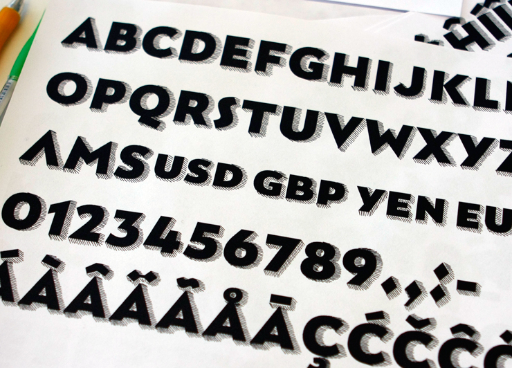
Typeface design in progress, from type-together.com
“TypeTogether educates users to turn around the common belief that typefaces just happen on a click, as this is not the case”
Tailored Typography
If there are plenty of typefaces to choose from, why bother in making a new one for my project? Well, chances are that your project takes place in a specific time, in a defined area or region, it has a particular set of specifications, and it’s aimed to a specific group of individuals expecting high quality outcomes. For those kind of projects, customised typography is the best fit.
Competitive advantages of custom type
Identity
Using a custom typeface enhances the personality and helps differentiating from the rest. José declares that using the same typeface for a bunch of logos is laziness, and proposes to ask a typeface designer for help and advise.
Exclusivity
Custom Typography gives you the option to buy exclusivity; in that way, you prevent yourself to find the same typeface of your project used in a different set of projects that are completely unrelated or lack of quality.
Compliance
Setting and following a set of parameters is crucial, is advised that both parties agree on them and understand them. Custom engineered typefaces are made to fit properly.
Pricing
It will vary according to the project’s level of complexity and the intended language. Chances are that a custom typeface may not be as expensive as you think, so again, go and ask to the Type Foundry of your preference. In addition, you do not need to purchase the whole variants of the family, instead buy one or two variants.

Veronika Burian
Type Designer (Praha)

José Scaglione
Type Designer (Praha)
Hinting
In the words of Jose and Veronika “Font hinting designates how outlines adapt to the analogue grid to more clearly render a font.” Hence the relevance to spend time and resources on the hinting process, as it guarantees typefaces are displayed properly.
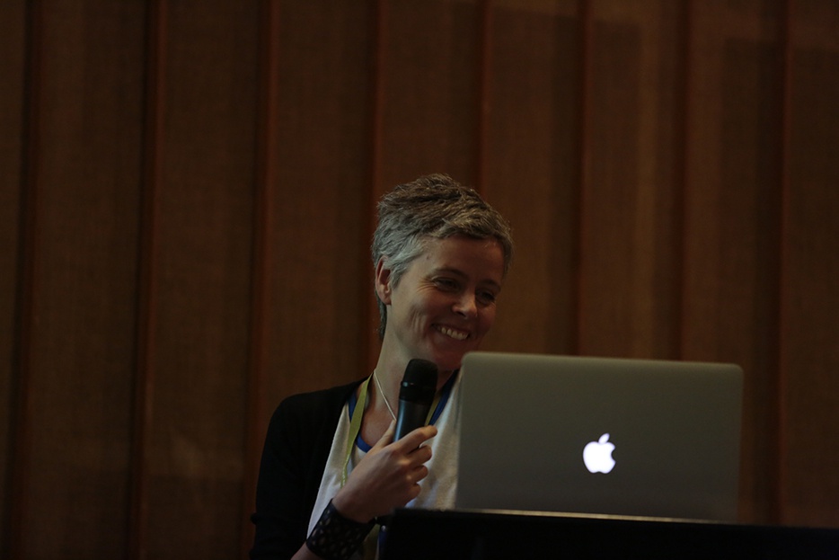
Veronika Burian at TYPO Berlin 2015 © Sebastian Weiß (Monotype)
Seven tips on custom typography, rephrasing TypeTogether case studies
Veronika and Jose presented a variety of case studies; they described the research process behind custom type, and shared their results.
Inspired by their idea to inform type users about custom type, the following list presents a personal interpretation of their findings.
1. Adjust, adjust, adjust
Yes, it is so important that you have to say it three times. Adjusting a typeface is crucial if you are going to use it on a logo, it will fit better. And remember, the best way to avoid laziness is to adjust your typeface.
(Adapted from VAG Rounded and Pomera case studies)
2. Multiconsultancy is great
You may need some help from time to time, try to reach Type Foundries and share projects with them. Collaboration and co-creation will boost your creativity, and will take you places you never imagined. Take the risk and see yourself grow.
(Adapted from SPORE case study)
3. Your style will rock
Custom typography also includes new styles of existing typefaces, creating a new style is inexpensive and at the same time very effective. Try this type of customisation to have a better fit than using your conventional typefaces.
(Adapted from LEVIS case study: a Cyrillic Bodoni)
4. Newspapers prefer ALL CAPS tilting from mass media
It could be a good idea to title fonts in mass media, especially as they are a vehicle for news and they are an important branding tool.
(Adapted from Whitney and Adele Sans case studies: Typefaces for Newspapers)
5. Do good, support great content
Participate in projects that will promote good content, that’s simple.
(Adapted from The Readability project case study)
6. Pixels are getting better
A lot has changed since the 8-bit era of the late 1980’s, then from Google displays in 2006 and Playbooks of 2015. Technology is evolving and so must your typefaces.
(Adapted from Literata case study: Pixels 1 and 2)
7. Keep trying
The whole process will take a long time, keep trying. You will struggle in your journey to find the typeface that better fits your job; continue with your hard work and contact a typeface designer.
(Adapted from The Process)
Connect
When in doubt, ask. And strive to contact Typeface designers, and Type Foundries; research about the ones in your city and your country, and get in contact with them.
You will confirm that in despite of the name or size of the studio, they all prefer to be contacted from the early stages of a project.
If all you have is an idea, pitch it, and politely ask for feedback. Take into account that they may take a long time to get back to you, some foundries are very busy. Be patient, all your efforts to find the best typeface to fit your job will pay off.
Ahoj typeface, from type-together.com.

GIVE AWAY
The TypeTogether team meet and created the Ahoj typeface, it is all about generosity and humanitarian help.
You can download the Ahoj for free at their website: www.type-together.com/freebies You can use it, you can create great things with it, and we encourage you to make a donation to your charity of choice (the TypeTogether team previously selected three charities to help the victims of the earthquake that struck Nepal.
AR


