


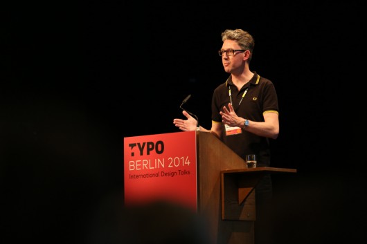
The second day of the conference must have been very intense for Paul.
After the Gerrit Noordzij interview premiere, he was invited on stage together with Petr and Erik van Blokland and Albert-Jan Pool to give us a better idea of the Noordzij type design school continuity.
In the afternoon you might have seen him intensely TypeCooking together with Erik van Blokland at their TypeCooker workshop.
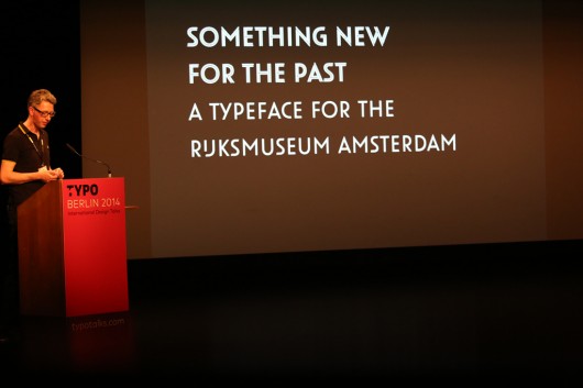
Finally, Paul stood on stage in the Show hall to tell us about the roots of his latest projects.

Paul’s interest in geometric sans-serifs is evident. In 2002, he was asked to design an exterior lettering for a Bauhaus building where his studio was based at the time. Paul decisively objected the architect’s predictable proposal to use Futura and started his research on geometric sans-serifs to find a more appropriate solution.
Starting at the origins, Paul observed classical proportions of Greek and Roman letters and then gave us a chance to compare features of such sans-serif milestones as Kabel by Rudolf Koch, Futura by Paul Renner, Metro Black by William Dwiggins, Two-Line Great Primer by Vincent Figgins and, of course, Akzidenz Grotesk.
It was not only these milestones that inspired Paul, as an old BLOEMEN MAGAZIJN lettering he found on the Anna Paulownastraat in the Hague had some of its features added to the final result.
The lettering for the Bauhaus building was made, accepted and executed in steel. Between 2002 and 2013, Paul extended that initial lettering to an amazing typeface — Oskar. It was released by BoldMonday in twelve styles, including meticulously drawn ‘split inline’ styles.
Another project which started with ‘just a logo’ was a modification of the Futura for the USA Today daily newspaper.
Paul explicitly explained which details of the typeface needed adjustments to make it suitable for USA Today. A coherence was given to the various terminals of the letters, ascenders and descenders were shortened, inconsistencies between styles were solved and two intermediate weights were added to the family. Combined with Chronicle by Hoefler&Frere-Jones, the revised Futura works great in the long format of the USA Today newspaper.
Finally, Paul spoke about his contribution to the identity of the Rijksmuseum, a Dutch national museum dedicated to arts and history. After a ten-year renovation, it was reopened in 2013.
Irma Boom, who was responsible for the new identity, invited Paul to collaborate on the Rijksmusem logo. Her first sketches were based on DIN, but Paul suggested a version based on Panno, a typeface by Pieter van Rosmalen released under BoldMonday.
After refining and adjusting shapes and proportions as well as finding a correct shape for a specific Dutch IJ letter combination, the logo was finished and extended to a typeface which is now used to set the names of different units of the museum.
Still, there was a scope for typographical work. A typeface for signage was needed, as well as a method to automatize micro typography for thousands of the signs in the museum.
Paul modified Panno typeface, making it even more suitable for signage and adding OpenType features to solve some typographical issues: for example, the figures in the years would be replaced by the smaller ones to achieve an even text flow.

Paul van der Laan
Type Designer, Typographer (The Hague)
BoldMonday can be proud of many beautiful specimens in various sizes — from the huge Rijksmuseum advertising banner in Amsterdam to the tiny napkin you can find at the Rijksmuseum’s cafe.
Text – Aleksandra Samulenkova – LucasFonts


