1. Roots is the topic of TYPO Berlin 2014. What comes to your mind, when you hear this theme?
The thread of graphic design and typography as an historical continuum; fundamental design principles that are relevant at any time and in any medium.
2. Which design project was good and fundamental enough to trigger modern ideas and concepts?
There are two which have had a profound influence on me:
Wolfgang Weingart’s 1977 Kunstkredit poster – first seen when I was a final year student at Bath Academy of Art in 1978. It was a real eye opener – typography as structure and the integration of type and image in a unified visual field.
Much later, seeing Wim Crouwel’s 1968 ‘Vormgevers’ poster provided an insight into the possibilities for generating letterforms from grid-based systems.
3. What relationship is there between your work and the TYPO theme?
That’s for the audience to judge. I hope they will see a relationship between structure and form through a generative approach to the visualisation of language.
4. Which are the 3 projects you are particularly proud of, and why?
Around ten years after the formation of 8vo, Mark Holt and I were starting to look for new approaches in our work – a lot of the early work had concentrated on the formal aspects of design; composition, colour, figure and ground, and so on. We were running out of energy to carry on working in a mainly subjective / expressive way
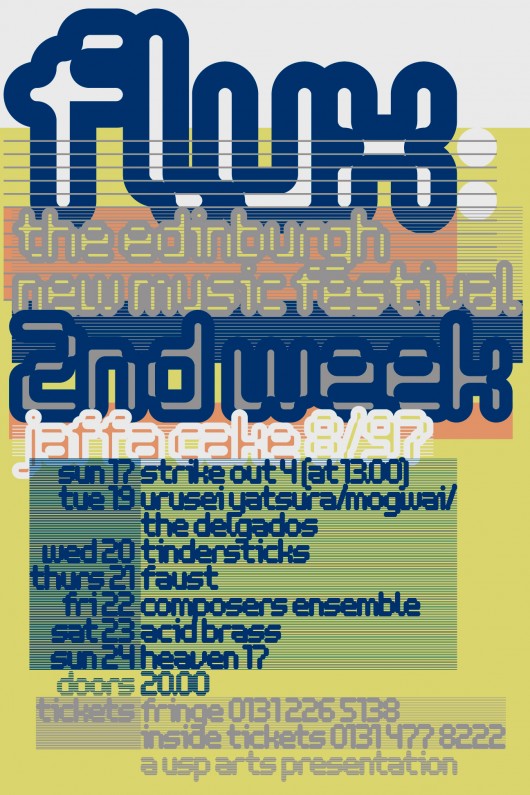
The posters 8vo produced for the Flux New Music Festival in 1997 and 1998 both employ systematic approaches to typographic composition. The first explores a system where all the typographic elements are modulated by a set of rules which relate type sizes to an underlying grid. The entire surface of the poster is treated as an ‘information mesh’.

© 8vo
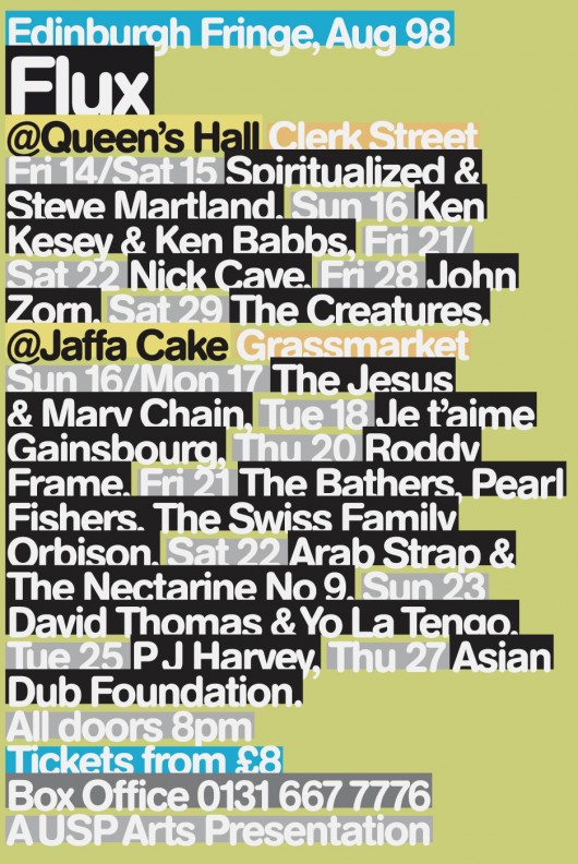
The 1998 poster employs a system of highlighting applied to a single size of type to generate information hierarchy. This was partly an anti-aesthetic stance, but it also had a pragmatic grounding – the final information for the poster was to be available only 48 hours before the print deadline – part of the concept was to design (in advance) a system for designing a poster; to define the rules for the system and to resist tampering with the outcome as much as possible.

© 8vo
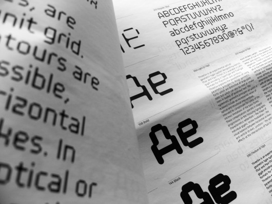
The final project is ‘ThreeSix’ which Paul McNeil and I worked on together over a period of two years prior to publishing the project in a Unit Editions Research paper in 2010. ThreeSix is an experimental optical/geometric type system of 6 typefaces in 8 weights.

Hamish Muir

© MuirMcNeil
5. Musts: What are, currently, your favourite books, exhibitions and artists?
I was very impressed with the recent book from Lars Müller publishers on the history of the Typografische Monatsblätter – it places already familiar work in the context of the journal’s editorial politics and provides fascinating examples of many lesser known works. I’m afraid I haven’t had time to visit exhibitions recently but will definitely see the Paul Klee exhibition at Tate Modern before it closes in March.
6. Give us 3 (digital) tools you currently cannot do without.
Illustrator, InDesign, Keynote


