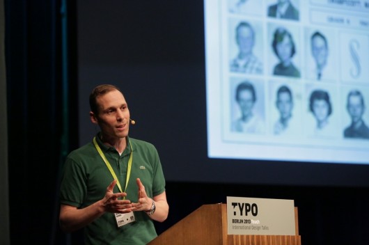
Manuel Krebs a designer from Switzerland and a funny one.
With his interesting visual martial Manuel convinces us: “Like humans the letters are looking at us.” You can clearly see this in the appearance of the lower case e. A Replica e looks already friendly in its facial expression, a Frutiger e laughs and a Rotis e laughs hysterically (similar to the audience at this point).
To join the loop to the typefaces Manuel and Dimitri design at Norm, he shows us the evolution of their font Replica that is based on the disappeared typeface Unica. Unica is a font that was originally designed as a measured hybrid between Univers and Helvetica. To see Replica looking at you visit www.lineto.com

Manuel Krebs
Another project Manuel shows us in his humorous way of presenting is the swatch brand optimisation. It started with re-drawing the original font and the noticing that the Swiss cross is not even centred. The amount of sub brands seem like a maze of possibilities for marketing people to add their own creations.
Norm tidied up the mess and presented convincing adaptations that could not be used because of the financial impact of implementing them. Finally they created a customised typeface and a set of sub logos that are constantly expanded. The once extensive guide lines manual was cut and cut and cut and cut until it fit onto 6 pages. To make sure everyone really uses the right typeface they changed the shape of the comma to make it unique. Watch out for it!Text — Sandra — GraphicBirdWatching


