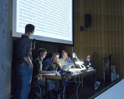
FontFont TypeBoard at TYPO Berlin 2013 © A. Blumhoff
Thinner thins, bolder bolds.Serif, sans serif, double serifs and swirls.
Glyphs, cyrillic, greek, latin.
Stencil, humanist, conical, diagonal.
F’s with flavour. Curves with character.
Q’s with tails turned upside down.
Spiekermann, van Blokland, Coles, Frohloff, Siebert, Gabrowitsch.
Hearing these heavy weights talk the talk was typographic music to my ears. I’m no font designer but as a graphic designer it’s almost a given that I’m a type lover. Plus I’ve done a fair share of work with type in my time, so you could also say I’m an advanced font enthusiast.
I must say, I felt a little like a fly on the wall, being privy to the open type review. It was almost as if I was eavesdropping, listening to and observing the masters critique the dozen or so shortlisted submissions hoping to earn a place in the ever so renowned foundry. The speed and pace in which they could rattle off fonts, the origins, identify a designer’s skill and level of experience, and convey the good and bad of each letter was just phenomenal. No surprises, they mind-blowingly know their stuff. It would be too much to try and re-cap specifics of the fonts in review. I also probably wouldn’t do the masters or any of the font designers justice.

Writer, Typographer (Oakland, California)
Stephen Coles is an editor and typographer living in Oakland and Berlin. He publishes
Fonts In Use and
Typographica, consults with type foundries on editorial content and with various organizations on typeface selection and licensing.
Stephen is author of the book
The Anatomy of Type (The Geometry of Type in the UK), and serves on the board of the
Letterform Archive. He was formerly a creative director at FontShop and a member of the FontFont TypeBoard.

Marketing Director / Monotype (Berlin)
Born in 1954, Siebert studied physics in Frankfurt. After receiving his degree in 1985, he worked as a science journalist, wrote his first book and moved from Frankfurt to Hamburg. There he co-founded the graphics magazine PAGE in 1986, and ran it as editor-in-chief until 1991, when he moved to Berlin. In Berlin, Siebert initially worked for two years for FSI FontShop International, where he published the first FontFonts, FUSE and the FontBook. In 1993, he took over marketing for FontShop Deutschland and in 1996, organised the first TYPO design conference; he started the Fontblog in 2004, and then in 2011, Creative Morning Berlin, as well as the TYPO offshoots in London and San Francisco. TYPO Days followed a year later. Since the autumn of 2014, he has been responsible for the German-language marketing for Monotype GmbH and initiated TYPO Labs and Brand Days.

Ivo Gabrowitsch is an eCommerce Marketing Director at Monotype and is responsible for FontShop,
Linotype, and
FontExplorerX.com. He also directed marketing activities for FontFont and FontShop before FontShop International was acquired. After having worked for several years as a media designer on different print and non-print projects, he attended the Beuth University of Applied Sciences in Berlin, where he was awarded a Graduate Degree in Print and Media Engineering. In 2006, he founded “Typostammtisch”, the regular typography meet-up in Berlin.
Photo: Norman Posselt

Type Designer, Programmer (The Hague)
Erik van Blokland is Co-Developer of robofab and UFO. He works as Type Designer and programmer and he teaches at Type & Media at the KABK in The Hague.

Art Historian, Information Architect, Type Designer, Author (Berlin, San Francisco, London)
Erik Spiekermann is information architect, type designer and author. Two of his typefaces, FF Meta and ITC Officina, are considered to be modern classics. He founded MetaDesign (1979) and FontShop (1988). He is behind the design of well-know brands such as Audi, Bosch, VW, German Railways and Heidelberg Printing, among others; information systems for Berlin Transit and Düsseldorf Airport and for publications like The Economist. He designed exclusive typefaces for corporations like Deutsche Bahn, Bosch, ZDF (German TV), Cisco, Mozilla and many others.
Erik is Honorary Professor at the University of the Arts in Bremen and in 2003 received the Gerrit Noordzij Award from the Royal Academy in The Hague. In 2006 he was awarded an honorary doctorship from Pasadena Art Center. He was made an Honorary Royal Designer for Industry by the RSA in Britain in 2007 and Ambassador for the European Year of Creativity and Innovation by the European Union for 2009.
In 2011 he received the German National Design Award for Lifetime Achievement and the TDC Medal as well as a Lifetime Award from the German Art Directors Club.
He was managing partner and creative director of Edenspiekermann with offices in Berlin, Amsterdam, San Francisco and Los Angeles until June 2014 when he moved from that position to the supervisory board. He now runs galerie p98a, an experimental letterpress workshop in Berlin. Erik splits his time between Berlin and San Francisco and London, where his son Dylan lives.
A book about his life and work “Hello I am Erik” was published by Gestalten Verlag in 2014.
Photo: Dennis Letbetter
But here are 5 things I learnt from the type casting:
- FontFont usually do families and not single weights. Families are expected.
- An idea should not be applied to one or several letters only. ALL the letters need to support one another.
- How would your font fit in the foundry? Difference is welcomed but would it sell? Do they need another geometric sans? How many more square typefaces does a foundry need?*
- Present well. Make it clear what you are submitting. Is it just one typeface or twenty? Standout specimens expressed clarity and details. Or at least they made sense.
- Arrows. They all seemed to really like arrows. Might just be worthwhile weaving in an arrow glyph or few.
Were any of the submissions accepted? We’ll just have to wait and see. All I can say is that the font enthusiast in me is still very much overwhelmed. But in the best kind of way.
*Side note: FontFont have more humanist sans serifs than any other library.
It better be pretty darn good if you go there.
Maggie Tang


