Four or so questions to … Paul Barnes

Paul Barnes is a graphic designer specializing in the fields of lettering, typography, type design and publication design. He is a partner with Christian Schwartz in the internationally acclaimed typefoundry Commercial Type. In the early 1990s he worked for Roger Black in New York where he was involved in redesigns of many magazines. He later returned to America to be art director of the music magazine Spin. Since 1995 he has lived and worked in London. He has formed a long term collaboration with Peter Saville, which has resulted in such diverse work as identities for Givenchy, ‘Original Modern’ for Manchester and the logo for Kate Moss.

Following the redesign of The Guardian, as part of the team headed by Mark Porter, Barnes was awarded the Black Pencil from the D&AD. They were also nominated for the Design Museum ‘Designer of the Year’. In September 2006, with Schwartz he was named one of the 40 most influential designers under 40 in Wallpaper*. A year later The Guardian named him as one of the 50 best designers in Britain.


Kate Moss logo by Paul Barnes


Frieze logo by Paul Barnes


1. Which work are you particularly proud of? Which work best represents your style or approach?
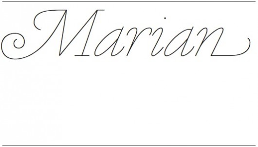
I think Marian probably best represents my idea of a typeface that references the past yet is contemporary; it is a revival, but looks nothing like the original. It is the reduction of form to its most minimal, whilst retaining the essences of the designs. It mixes my interest in high level craft with a graphic designers sensibility.


Marian typeface by Commercial Type


2. We chose “Touch” as the theme for this year’s TYPO Berlin. In your opinion, what qualities does design need to have to touch people’s lives? Can you name an example for for design work that had this effect on you?  

Design to me can touch people in many ways; from the better and speedier understanding of information, such as Beck’s Map of London, through to designs that make simple tasks easier, like well designed books, such as the Penguin books by Tschichold. But design can also bring pleasure to people; whether it be a simple Insel Bücherei book of the 1920s, or a beautiful record sleeve by Peter Saville from the 1980s. In the case of typefaces it’s the same; we have wonderful examples of typefaces such as Georgia that solve problems, such a reading on screen. And then we can find typefaces that are well considered and are making the reading experience, more expressive, more beautiful, more rewarding. Of course this may be often a very small improvement on someone’s life, but design is often on this level, overall it improves our world.


3. Is there someone you always have wanted to get in touch with, but so far haven’t? Who do you especially look forward to getting in touch with at TYPO Berlin?

I think the pleasure of all conferences is the surprise of meeting people you never knew you wanted to meet; going to a talk by chance and seeing work quite unlike your own that touches you. Of course it will be good to see old friends like Erik Spiekermann and Erik van Blokland. I definitely want to see Kate Moross and Anthony Burrill, who do something very different from what I do, but I really like what they do.

Paul-Barnes-web

Paul Barnes

Paul Barnes is a graphic designer specializing in the fields of lettering, typography, type design and publication design. He is a partner with Christian Schwartz in the internationally acclaimed typefoundry, Commercial Type. In the early 1990s he worked for Roger Black in New York where he was involved in redesigns of many magazines. He later returned to America to be art director of the music magazine Spin. Since 1995 he has lived and worked in London. He has formed a long term collaboration with Peter Saville, which has resulted in such diverse work as identities for Givenchy, ‘Original Modern’ for Manchester and the logo for Kate Moss. Barnes has also been an advisor and consultant on numerous publications, notably Wallpaper*, Harper’s Bazaar and frieze. His interest in the modern and vernacular is encompassed in his type design ranging from the contemporary such as for Björk, through to the extensive British modern, Brunel as seen in Condé Nast Portfolio. Whilst consultant to The Guardian he designed Guardian Egyptian with Christian Schwartz. He has designed typefaces for the National Trust in England, the numbers for Puma at the 2010 World Cup and most recently the numbers for the England football team for Umbro. For Commercial Type he has co designed Publico with Schwartz, and independently Austin, Dala Floda and Marian. Following the redesign of The Guardian, as part of the team headed by Mark Porter, Barnes was awarded the Black Pencil from the D&AD. They were also nominated for the Design Museum ‘Designer of the Year’. In September 2006, with Schwartz he was named one of the 40 most influential designers under 40 in Wallpaper*. A year later The Guardian named him as one of the 50 best designers in Britain.

4. Required reading/watching: What are currently your favorite interesting/beautiful publications, exhibitions, books, TV-shows, movies, apps and/or websites?

I am slowly going through a list of 1000 books to read before I die; so I’ve finally read many classics: Dickens, Mann, Conrad and many others have left a lasting impression on this 40 something. But also are the surprises: PG Wodehouse, Evelyn Waugh, things I would not like. I am enjoying listening to the BBC archive, listening to Nikolaus Pevsner’s lectures which I thought long lost. I’ve also found this: one man’s obsession in collecting design classics of modern design. I am also looking forward to listening to the new album by Night Works.

I am big cycling fan so the Inner Ring is a wonderful inside track.