Tony Chambers: Getting a Stiffy

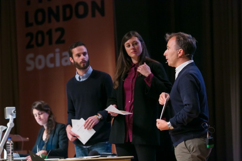
The title of Tony Chambers’ talk calls for explanation. Stringing along with Eike König, the previous speaker on stage, Chambers also announced that he would not be showing his own work, but work by others instead. As Creative Director and Editor-In-Chief at Wallpaper* Tony Chambers has received numerous invitation cards to all kinds of shows of the fashion industry. Accompanied by his assistants Sarah, Lee and Rose he presented his extensive collection of the last ten years, commenting on their typographic quality, production and overall looks. In this context, Chambers explains, a »stiffy« is an old-fashioned colloquial term for a »thick, elegant invitation to something rather grand«.


Early on in the talk Tony Chambers explains the thought process behind most cards that are being designed: »The shinier, the heavier, the thicker, the bigger, the better – perhaps a bit bling.« Chambers and his assistants began piling up the invitation cards one by one on a table on stage. Several major fashion labels were included in this extensive review. After showing the first few »stiffy« examples, the speaker suggested that sometimes it is »cooler« to go with a thinner invitation instead. Even for those at Logan Hall who did not immediately recognize the wordplay in the talk’s title, it became quite obvious through Erik Spiekermann’s interjection from the audience, suggesting one would be »getting a floppy« when receiving a very thin letter.

Everything from glasses, handkerchiefs, lots of fans and pop-ups to woolly hats, combs and an actual potato – all invitation cards – followed. The audience witnessed a wide range of extravagant examples including prints on leather and others »really pushing the boundary of novelty«. Several times throughout the talk Chambers critically questioned the amount of money spent on some of these fancier cards, wondering whether it could have been spent on something else.

Towards the end of his talk Tony Chambers emphasized examples that were »show-offy but true to the brand« and presented more unconventional, slightly intellectual ideas and approaches that revealed a little more about where the labels come from and what they stand for. Taking on calligraphic and the lettering details applied to several cards Tony Chambers suggests that »in the digital age the hand is more than ever valued«. »It’s the best moment to be a graphic designer and typographer« are the final words of this talk on an overwhelming diversity of stiffies.

chambers-web

Tony Chambers (Wallpaper*)

Tony has driven the growth of the Wallpaper* brand through the development of a hugely successful website, exhibitions and events and the iconic series of pocket City Guides published in conjunction with Phaidon press. He  joined Wallpaper* as Creative Director in  2003 and was appointed Editor-In-Chief in 2007. Since joining Wallpaper*, he pushed the highly respected re-design, including the creation of  a new and unique font for the magazine thus attracting some of the world’s most exciting and talented photographers and illustrators. Prior to Wallpaper*, Tony had been Art Director at Condé Nast’s flagship male lifestyle title, British GQ Magazine for six years. During that period he also acted as a creative consultant on other International Condé Nast titles. Prior to joining Condé Nast, Tony was Art Editor of The Sunday Times Magazine. Tony has twice received the title Art Director of the Year at the prestigious Periodical Publishers Association Awards. He picked up the award for New Editor of the Year by the British Society of Magazine Editors in 2008 and this year was named Editor of the Year for Lifestyle Magazines. Where editorial design currently stands and what it needs to achieve to remain in peoples awareness (and be bought by its readers)? Tony‘s TYPO speech will cast light on the scene.

By Ferdinand Ulrich