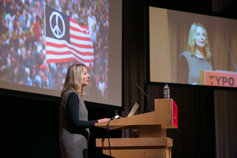
Paula Scher: Breakthroughs, Successes and Failures

Paula Scher is a an artist pretending to be a designer. With an upbringing that incorporated a rejection of modernist uniformity and embracing a revolutionist counter-culture of peace, she began her career working at CBS as an art director. Her work now covers all facets of design, yet is always anchored in a strong & consistent visual language.

Paula Scher © Gerhard Kassner


Her typographic identity for The Public Theatre in New York City was based on American wood-type. This is a radical early example of a developed visual language as opposed to a logo, which enabled the theatre to stand out from the crowd. Unfortunately it worked so well, it was quickly imitated, repeated and usurped by the surrounding environs.

“We don’t want to save the world. We want to raise the expectations of what design can be.”

She states the success you get from doing something you are good at, is actually detrimental and stresses that design in a different field enables growth as a designer. Her desire is not merely to craft identities, but to make them carry on afterwards and be consistent, regardless of how many marketing directors handle them. This, she claims is not design in the traditional sense, but another social skill of people organisation.

Her identity for Type Directors Club was based on concentric patterns. Her desire to push the envelope resulted in another aspect of social design in which 12 designers developed their own ideas over 3 months, resulting in variations of the same core principal. Her new logo for Windows 8, designed around a concept of perspective, was leaked onto the blogosphere to much furore from the design industry. This was terrifying yet consecutively by her own definition: social.

From projects encompassing urban planning to environmental graphics to map painting, Paula Scher’s work contains one overarching theme — ALL design is social.

Paula-Scher-web

Paula Scher (Pentagram)

Paula Scher is a giant of contemporary graphic design. Her place in the pantheon of modern greats is secure. But she is not in the pantheon of greatness because she is one of the few high profile female designers of the current era; nor she is there because she is a partner in the eternally respected Pentagram. Rather, she is there because she is a bona fide graphic genius who works in the mainstream of public life and yet still manages to produce work of rare distinction and enduring merit. A Pentagram partner since 1991, Scher’s landmark identity for The Public Theater ‘fused high and low into a wholly new symbology for cultural institutions, and her recent architectural collaborations have re-imagined the urban landscape as a dynamic environment of dimensional graphic design’. Paula Scher is a ‘social’ designer in the best sense of the word – her work is literally on the streets and in the buildings where people live, work and study. Scher is an electrifying conference speaker. Her sense of humour, and her gutsy aura of realism makes for an inspirational mix. (Photo: Christian Witkin)

By: Graphic Birdwatching