


The first full day of presentations on Day Two at TYPO London hit the ground running with Michael B Johnson, PhD, who leads the Moving Pictures Group at Pixar Animation Studios. At the start of Making Movies is Hard Fun: Building Tools for Telling Stories he asked to not record his presentation in any shape or form, to make sure the PR people wouldn’t kill him. As a flash went off right after that announcement, he added “And if you do, please keep it private”. Michael’s request seemed overly cautious, but soon began to make sense – he proceeded to guide us through Pixar’s history and philosophy, its production pipeline, and illustrated this with some case studies. Along the way he revealed quite a few intimate details about Pixar’s way of working. He explained how storyboards are developed then reboarded and reboarded until they are just right, where some of the inspiration for specific scenes comes from, how colour schemes influence the flow and the mood of the scenes, and so on. A subdued yet consummate speaker, Michael peppered his informative and inspirational talk with countless Tweetable quotes, like John Lasseter’s “Quality is the best business plan”, and my personal favourite, on how difficult and much work it is to produce a film: “Pain is temporary. ‘Suck’ is forever.” He ended by describing his team’s work designing, building and supporting Pixar’s custom workflow for film development as “We create tools to remove tension from the room”.
The second speaker was media designer Joachim Sauter from Art+Com, a design studio which grew out of an interdisciplinary group of designers, architects and artists coming from various departments of the Berlin University of the Arts and hackers from the ChaosComputerClub. Although I had already seen some of the projects shown in Renaissance of Space at TYPO Berlin 2010 “Passion” I was thrilled to revisit those alongside the new ones I first saw here. While the audience marvelled at the ingenuity of the projects, it was clear that technology was never used for the sake of technology, only to support the narrative. From one mind-blowing installation to the next, we were treated with enchanting images in which design meets art in space. They are now collected as seven-year technological cycles – Predict, Prove, Prevail, Present – in the retrospective book ART+COM – Media Spaces and Installations, published by Gestalten in both German and English. Joachim concluded his presentation with an overview of Art+Com’s philosophy, and talked about the interaction with his students. As an extra he singled out Image Fulgurator by one of his students Julius von Bismarck. This project is brilliant in its concept and as well as in its execution as it merges politics, social activism, design and art. The Image Fulgurator, a device for physically manipulating photographs, intervenes when a photo is being taken. The photographer doesn’t detect anything, as the manipulation is only visible on the photo afterwards. The accompanying video showing the process and the baffled reaction of the people discovering the manipulation of their photographs was very amusing.
I was one of many supporting independent filmmaker Gary Hustwit’s Kickstarter campaign to help fund Urbanized, the third instalment in his design trilogy after Helvetica: The Movie (2007) and Objectified (2009). In We Built This City… Gary discussed DIY urbanism and showed clips from his latest documentary – again we were asked not to make any recordings. We began with footage of the public space revolution Occupy Wall Street as an example of a city within a city, with a DIY infrastructure. Park(ing) Day is all about reclaiming public space from the car – an annual open-source global event that invites citizens everywhere to transform metered parking spots into temporary parks for the public good. Gary then shifted his attention to the challenges of post-industrialist Detroit whose population shrunk back to half of its original size, showing how grassroots initiatives make neighbourhoods to flourish again. On a micro-scale poster pocket plants engage with urban environments and reclaim advertising space by creating makeshift flower pots in wheat-pasted posters. On our side of the Atlantic Brighton’s Tidy Street records energy usage and visualises it with a graph painted on the street, raising people’s awareness and changing their behaviour. More fantastic simple and common-sense urban art projects were showcased, including the moving I Wish This Was by artist, TED Fellow, Urban Innovation Challenge Fellow, and co-founder of Civic Center Candy Chang. At the end of his presentation Gary issued a challenge to designers everywhere:
- Identify a problem in your city
- Get some friends together
- Brainstorm ways to fix that problem
After lunch it was time for one of the Co-Conference Directors of TYPO London to take the stage. I missed Tim Fendley at TYPO Berlin 2011 “Shift” because I attended Doug Wilson’s preview of Linotype: The Film that was on at the same time. I was very happy I got a second chance at catching Legible London. Tim is co-founder of Applied_, a consultancy that designs wayfinding information. He is currently the leading system designer for Legible London, a capital-wide pedestrian wayfinding scheme for Transport for London, currently in pilot phase. When it is complete, it will be the most extensive of its kind in the world. Stating that things should fit people instead of people fitting things, Tim illustrated many of the pitfalls and misconceptions in wayfinding for urban environments with hilarious examples of ineffective and downright unintelligible signage. He shared some of his findings which were quite surprising, like for example the fact that barely 3 to 4% of city signage is actually looked at. Many people prefer cars over public transport because the level of uncertainty at change-over points is limiting, 50% of the journeys by underground are quicker to walk, and distances should be defined in minutes, not distance as people in London are prepared to walk 12 to 15 minutes. All these findings combined with empiric research in situ helped the Legible London team develop “miniliths” that are now being installed in select areas of London. Tim’s main point was that good design is user-centred, research-based, and user-tested. Not only was this a very informative presentation, but I also personally experienced the effectiveness of this new program when returning to the hotel on Friday and Saturday night.
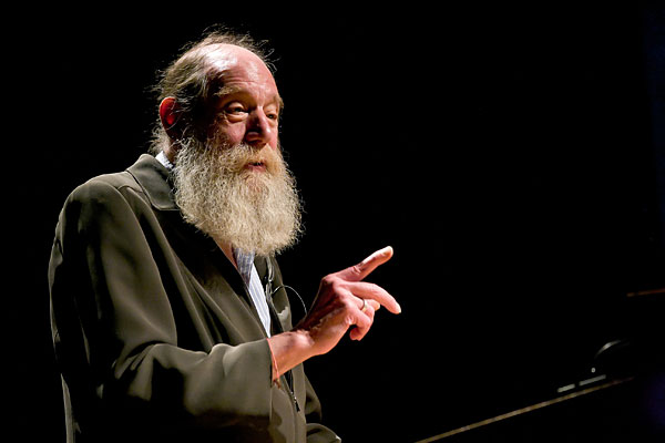
As soon as Lawrence Weiner – one of the key figures of Conceptual Art – introduced himself, I realised I made the massive mistake not to research his work and background beforehand. Still his presentation was captivating. In a pleasant baritone the artist talked about his work and philosophy; about his life; and about art and design in general, stating that design is about viscerality and art is about sensuality, and that design is information that doesn’t need explanation. It was a wonderful talk, like listening to your grand-father recounting anecdotes of his past. Due to a local internet outage in London the programmed live stream of Lawrence Weiner’s session didn’t happen. To make up for this inconvenience a recording can still be viewed on the TYPO Talks website. Do yourself a favour – stop whatever you are doing for half an hour, grab a drink, and enjoy.
TYPO has always been a conference of contrasts – the artist Lawrence Weiner was followed by the UX designer Tom Uglow, who leads Google’s Creative Lab in Europe, working on new ideas and global brand projects for Google and YouTube, with The Art of Post-Digital. In a self-deprecating style he calls himself someone who knows a little of a lot of disciplines, describing what he does as “pushing ideas until they fall flat on their face.” Tom considers television dead as there is nothing interactive, and is fascinated by all these exciting projects that are initiated by people who are very young, who don’t know what they are not supposed to talk about. Contemplating our obsession with uploading, he pointed out that “Data is not spreadsheets. (…) Data is everything. Everything has a point. (…)”. What followed was an overview of projects he worked on – from Android and its silly-fun app Androidify, via explaining and promoting Chrome for Google, to the YouTube Space Lab and YouTube Symphony Orchestra for YouTube. We were shown the trailer for The Life In A Day project that was made into a feature film. I couldn’t resist to chuckle at Tom’s very conscious effort not to mention Facebook when talking about Google+. He commented on the invitation for users to make their own version of the very first Google ad that we shouldn’t be afraid of re-appropriation. Allowing people to take what you make and remake it is really powerful. All in all an interesting talk, although I agree with Gerry Leonidas that Google money buys you a lot of content, not necessarily a lot of substance.
The penultimate presentation was by Susana Rodríguez de Tembleque, executive creative director of SYPartners, a firm that helps companies design their future. Before her presentation she conducted a fun little experiment in order to get to know her audience. Design: The Art of Creating an Experience dealt with two defining moments in her career – her first big job and her first dream job. She shared the moment in 1997 she truly became a designer, when her art director threw out all her designs for a commemorative book, pinned five blank sheets of paper on the wall and told her not to design but to create an experience. Fast forward to 2009 when she was given carte blanche to commemorate the 100th anniversary of IBM. She created Think – An Exploration into Making the World Work Better, an exhibition in the Lincoln Center in NYC. It consists of a digital wall visualising diverse data, a film which is displayed across 40 free-standing screens, and interactive stations where people can explore how technology affects their everyday life. In the production Susana explored paradoxes like science vs. art, expert vs. novice, technology vs. humanity, commerce vs. philanthropy, hard work vs. fun. She considers them not mutually exclusive, calling them false paradoxes which should be avoided by keeping one’s mind open to all possibilities.
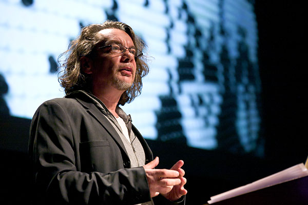
Design icon Neville Brody, who currently operates through his Research Studios network, was the perfect headliner for Day Two. Somewhere in the first part of his talk he stated that he is “so fucking angry” at the current government which has thrown the UK back in time 150 years with regards to economic inequality. Looking at his recent achievements I am starting to suspect he truly is at his best when he is angry. This sentiment was echoed by Lawrence Weiner earlier who said that art is made from anger. Neville’s seemingly freeform talk offered numerous inspiring concepts and a string of powerful visuals, and addressed ideas and values. The first part focused on the Anti Design Festival which occupied for London for seven days. The second part showcased FUSE, both then and now. After a 13 year hiatus issues 19 & 20 of FUSE are to be published soon, as well as a compendium of FUSE 1–20 of over 400 pages. Investigating how creativity and possibilities be embedded in typography, Neville Brody is creating experimental typefaces again. He is also returning to his experimental magazine design roots, which results in very nice typographic work to go with his political ideas. To conclude Neville Brody strolled through 20 years of FUSE. His main criticism was that nowadays digital media is largely utilitarian; you don’t find this kind of experimentation anymore. Just like Tom Uglow Neville Brody encourages re-appropriation and interpretation of the FUSE fonts. As the basic idea behind FUSE 20 years ago also was that the users change and expand the fonts, he is still pursuing the same ideas. This was the perfect way to end the day – TYPO Berlin came out of FUSE Berlin, which came out of FUSE London, so the circle is closed with TYPO London.

Neville Brody

Susana Rodríguez de Tembleque

Tom Uglow

Lawrence Weiner

Tim Fendley

Gary Hustwit
Filmmaker (New York)

Joachim Sauter
Media Designer (Berlin, Germany)

Michael B. Johnson
Text — Yves Peters a.k.a. Bald Condensed, courtesy of The FontFeed; Photographs (3): Gerhard Kassner


