


 (Photo: Gerhard Kassner)
Keen not to be drawn on the topic of the blurred boundaries between design and his art, Jon was quick to point out that he functions on three distinct levels; as a designer, a publisher, and as an artist. Though there may be a cross pollination of sorts at times (design and typography being a vehicle for much of his art, being the most obvious), they are none-the-less separate entities. ‘Art and design are good friends’ he pointed out, ‘but they are different things’.
Talking through his personal projects he seemed a little uncomfortable, though it’s understandable why. They are personal. None were designed to a brief or budget. There was no committee. They are thoughts, conversations and memories. And an audience of designers and typographers, though most familiar, can often be the harshest critics of all, as the comment streams on most design blogs will testify.
If Jon were to work with oils, or clay, there would be less confusion over the boundaries of his roles, but he chooses to use his most trusted and practiced tools — his graphic art and appreciation for print — as a vehicle for his personal work. To Jon, books feel like ‘part of the performance’. The smell, the pace, the narrative, all converging to create something unique, and through production and distribution place a definitive marker in history.
Similarly, the use of brass in his work is another example of a desire to celebrate the ‘now’ with a little longevity, with each piece destined to live on well beyond it’s creator.
The notion of placing a ‘marker in the ground’ is particularly evident in 136 Points of Reference, where his venture into the art world first began. The book represents a collection of things that had most affected him up until that point in time, cataloging inspirational references such as objects, books and moments, intimately revealing his thoughts at that time. Much is made of the role of a designers references in shaping their output – whether it be the books they read, the blogs they subscribe to or the art they collect, all shaping the designer in some sense. Bibliotheque, for example, have made no secret of their affection for modernist pioneers such as Dieter Rams and Otl Aicher, and that influence is clear in their work.
Jon was however keen to point out that while reference points are important, there comes a time when you have to leave them behind to find your own voice. ‘If you are constantly swimming with the same points of reference you become a shadow of someone else’. By publishing that book he was doing exactly that – respectfully nodding to the past, but turning the page of a new chapter.

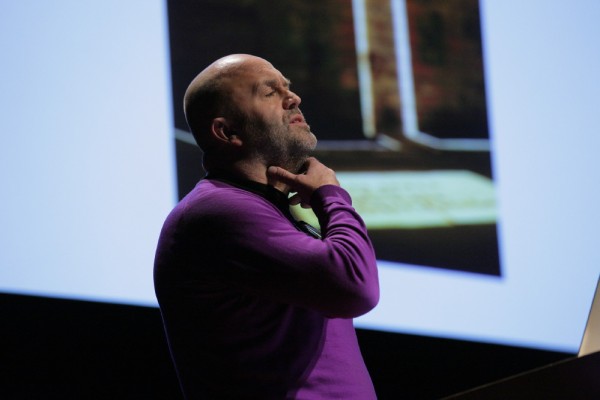
Jonathan Ellery
Sadly questions were not permitted at the end of the talk. Had they have been I would have been intrigued to discover Jon’s thoughts on whether commercial art projects, such as the Bell & Ross commission, would have been responded to differently had it been undertaken by his studio under his stewardship. It’s those few instances, when art crosses over and becomes commercial, that I can imagine the most friction resides, as it would be difficult to draw distinction between Ellery the artist and the designer. Can one operate without the other?
Text: Matt Judge


Pingback: Fontblog | TYPO London 2011 im Rückblick