A (Bald) Condensed View on Day One of TYPO London “Places”

My first day at TYPO London was quite an experience. Entering the lobby at Logan Hall felt like stepping back in time a few months. The professional and efficient welcome and wonderful organisation amounted to the great atmosphere the sister conference TYPO Berlin is so famous for. Seeing all the familiar faces made it feel as a deja vu, but a fresh and exciting one. Nonetheless it immediately struck me that this London edition has its own distinct identity, its own quirky personality.

Photo: Gerhard Kassner


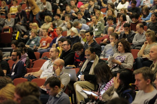
This first day kicked off with Erik Spiekermann introducing the facilitators in his characteristic irreverent style. Lynda Relph-Knight and Adrian Shaugnessy did a brilliant job. They were easily as interesting as the presenters, asking pertinent questions and offering short additional insights.

Starting 15 minutes late (to no fault of his own) Dale Herigstad opened with Media Space: Where is what? What is where?, exploring what happens when digital media leaves the screen. After briefly walking us through the evolution from the static flat rectangle via moving images to virtual space, he showcased a series of impressive solutions using innovative spatial concepts. His presentation ended in retro-futuristic mode with all attendees wearing cardboard three-dee glasses – the ones with red and blue mica lenses – to see media interfaces using the three dimensional plane.

With Telling the right story, Nat Hunter, Creative Director at Airspace, talked about the importance of storytelling, showing the audience that information plus narrative equals powerful communication. Nat’s fascination with this subject had been sparked by studying the psychology of human-computer interface at college. She went through a series of varying projects, ranging from an educational short for the Northern Gallery of Contemporary Art using an irreverent take on information design, to an educational movie for DFID and the BBC World Service on the concept of “Communication is aid.” Social consciousness and sustainability shone through her work, making it meaningful, relevant, and ethically sound.

The most informative presentation for me personally was BBC’s Global Experience Language in 27 languages and 9 scripts, by Kutlu Çanlıoğlu, Senior Creative Director for BBC World Service, and Titus Nemeth, type designer, typographer, student and teacher. Kutlu started by explaining the subtle cultural differences between the diverse nationalities that are served by BBC World Service, and how these are translated to the different regional websites. On a typographic level the different scripts used for those 27 languages posed complex problems in achieving a coherent and unified visual identity that remained locally relevant. In the second part of the presentation Titus Nemeth focused on the typographic side of things. After giving a brief but fascinating insight in the Arabic script he showed how his typeface Nassim was thoughtfully customised to cater to the cultural affinities of the different nationalities that use the script.

After the coffee/tea break Jonathan Ellery, conceptual artist and founder of London based design studio Browns, mainly talked about his work in The here and the now, where it comes from and what it’s about. He did so by going through the artist’s books he published through Browns Editions. In a subdued and personable, quite intimate style that left some in the audience slightly uncomfortable, he discussed the underlying narratives and meanings behind his books and art installations

Equally honest was Tony Brook, creative director/co-founder of Spin and co-founder of Unit Editions, with Bred in the bone. In the first part of his lecture he showed some of his highly reductive yet very interesting design work, doing more with less. He shared his almost obsessive love for Wim Crouwel, both the designer and his work, and talked about curating the major retrospective of the Dutch master’s work at the Design Museum in London. The second part had him examine in a humorous, tongue-in-cheek way if a shared (Northern) culture could create a distinct creative approach. Especially his self-deprecating analysis of the Northern identity elicited quite a few laughs.

The first (half) day of lectures ended on a high note with The only important decision by Michael Bierut, partner at Pentagram, New York. After explaining where he came from and how he became a (graphic) designer, Michael went through ten projects where the selection of the typeface was the most important aspect. The selection process in each of these projects was informed by places, by their geographic and historic location. These examples showed that a clear rationale is beneficial to this process. Michael is a very skilled presenter, possessing the comedic timing of an experienced stand-up comedian. His presentation was spruced up with offbeat remarks and hilarious one-liners which had the audience in stitches.

And thus ended the first day. Everybody went off to have free drinks at the Cicada bar, except me, because it’s a dirty job and somebody’s gotta do it. More tomorrow.

Text: Yves Peters a.k.a. Bald Condensed, courtesy of The FontFeed

Erik Spiekermann © Dennis Letbetter

Erik Spiekermann

Art Historian, Information Architect, Type Designer, Author (Berlin, San Francisco, London)

Erik Spiekermann is information architect, type designer and author. Two of his typefaces, FF Meta and ITC Officina, are considered to be modern classics. He founded MetaDesign (1979) and FontShop (1988). He is behind the design of well-know brands such as Audi, Bosch, VW, German Railways and Heidelberg Printing, among others;  information systems for Berlin Transit and Düsseldorf Airport and for publications like The Economist. He designed exclusive typefaces for corporations like Deutsche Bahn, Bosch, ZDF (German TV), Cisco, Mozilla and many others. Erik is Honorary Professor at the University of the Arts in Bremen and in 2003 received the Gerrit Noordzij Award from the Royal Academy in The Hague. In 2006 he was awarded an honorary doctorship from Pasadena Art Center. He was made an Honorary Royal Designer for Industry by the RSA in Britain in 2007 and Ambassador for the European Year of Creativity and Innovation by the European Union for 2009. In 2011 he received the German National Design Award for Lifetime Achievement and the TDC Medal as well as a Lifetime Award from the German Art Directors Club. He was managing partner and creative director of Edenspiekermann with offices in Berlin, Amsterdam,  San Francisco and Los Angeles until June 2014 when he moved from that position to the supervisory board. He now runs galerie p98a, an experimental letterpress workshop in Berlin. Erik splits his time between Berlin and San Francisco and London, where his son Dylan lives. A book about his life and work “Hello I am Erik” was published by Gestalten Verlag in 2014. Photo: Dennis Letbetter
Lynda Relph-Knight

Lynda Relph-Knight

Lynda Relph-Knight is a design writer and independent consultant. She was editor of the weekly magazine Design Week for most of its 25-year life, before it went solely online in June, covering all aspects of commercial design including typography and communication design. She is a fellow of both the Royal College of Art and the Royal Society of Arts and has been awarded an honorary MA in design by the University for the Creative Arts.
Dale Herigstad

Dale Herigstad

Dale is a thought leader on the future of media consumption in an interactive and “many-screen” world of increasingly rich media interfaces. With an extensive background in Broadcast Design and branding, he was creative director of on-air design and branding for the three CBS Sports Winter Olympics broadcasts in the 1990s. Having his roots in the rich media approach to design in TV and film, he has pioneered a unique spatial approach to designing navigation systems for Interactive TV and connected screens. The work begins to blur the line between television, games and web, a concept he calls "New Television." Dale was a part of the research team that developed the visionary gestural interfaces that first appeared in the film “Minority Report,” and is now leading development work in the rapidly emerging world of gestural navigation for screens at a distance. Screens have always defined unique spaces, and, particularly with advancements in stereo 3D projection and advanced AR, information can occupy these spaces. Spatial context is becoming increasingly important in design that is no longer flat: space and place are the new frontiers of design. Dale has an MFA from California Institute of the Arts, where in 1981 he taught the first course in Motion Graphics offered to designers in the United States. He served on the founding advisory board of the digital content direction at the American Film Institute, and was an active participant in the development of advanced prototypes for Enhanced TV at AFI for many years. Dale has won four Emmy awards. Dale was co-founder of interactive agency Schematic, which recently merged with three other agencies to become global powerhouse Possible Worldwide. He resides in London.
nat_portrait-web

Nat Hunter

Nat is a Design Director at the RSA in London, using design to close the gap between our every day behaviour and the future to which we aspire. She is also working on various other digital and art projects. She was one of the founders of Airside and of Three Trees Don't Make a Forest and is currently on the executive committee of D&AD.
Kutlu Çanlıoğlu

Kutlu Çanlıoğlu

Kutlu Çanlıoğlu is Senior Creative Director for BBC World Service, a role where he is responsible for the user experience and design of 27 different language services, including those in Arabic, Russian, Mandarin, Hindi, Urdu, and Spanish. He studied architecture and sociology at Istanbul's Mimar Sinan University before working as a graphic designer at the daily newspaper Radikal. He then joined EK Ltd, a studio specialising in editorial design, and worked with a wide range of print and digital projects for clients including the UN, Istanbul Foundation for Culture and Arts, Goethe Institute, Unilever and Wyeth. He moved to London to complete an MA in Typography at the London College of Printing where he gained recognition for exploring the relationship between type and punctuation in an innovative and ambitious interactive motion graphics piece. At the BBC World Service he runs a team that designs news websites and mobile products across nine different scripts as well as the multi-lingual content management systems that drive them. He is also responsible for info-graphics and data visualization projects to support the 24/7 multi-lingual news coverage for diverse audiences around the world. Kutlu is also the Typography Discipline Lead at the BBC, responsible for championing the role of craftsmanship around typography in the context of the BBC's new Global Experience Language.
Jonathan Ellery

Jonathan Ellery

Jonathan Ellery is the founder of London based design studio Browns. Since it opened for business in 1998, Browns has built a reputation for its progressive and conceptual approach to design. It brings artistry, wit, rigour and skilful management to projects large and small, ambitious and unassuming. Its definition of design is broad, its points of references are from much further a field, as are its collaborations. In April 2011 Browns was named design studio of the year by Creative Review Magazine. In 2005 Ellery launched Browns Editions, the publishing arm of Browns which produces limited edition photography, and conceptual art books. With so much emphasis on screen based, digital technology these days, Ellery sees Browns Editions as offering a precious enclave of resistance. 2005 also marked Ellery’s first notable shift towards balancing design and his work as a solo artist. With four one man shows in as many years in London and New York, his fifth, The Human Condition, is to be shown in London, Spring 2011. He works across a wide range of media from sculpture to performance, film to photography. The medium of book art is also central to his work, molding paper, fonts and images as he would any other medium, to create tactile, hand numbered, objects of art.
Tony Brook

Tony Brook

Born in Halifax, West Yorkshire, Tony studied at Percival Whitley College of Further Education and then at Somerset College of Arts and Technology in Taunton. Tony lectures nationally and internationally and is currently an external examiner for the MA Brand Identity course at the London College of Communications. Tony is guest curator of ‘Wim Crouwel - A graphic odyssey’ a major retrospective of the Dutch master’s work currently on show at the Design Museum in London. He was admitted to the Alliance Graphique Internationale in 2006 and is the current president of the UK chapter.
Michael Bierut

Michael Bierut

Michael Bierut studied graphic design at the University of Cincinnati’s College of Design, Architecture, Art and Planning. Prior to joining Pentagram’s New York office as a partner in 1990, he was Vice President of Graphic Design at Vignelli Associates. His clients at Pentagram have included The Council of Fashion Designers of America, The New York Times, The Museum of Arts and Design, United Airlines, The Brooklyn Academy of Music, Harley-Davidson, Princeton University, the Morgan Library and Museum, Saks Fifth Avenue and the New York Jets. He has won hundreds of design awards, and his work is represented in the permanent collections of museums around the world. In 2002, Michael Bierut co-founded Design Observer, a blog of design and cultural criticism. Today, the site is the largest design publication in the world. In 2008, he was named winner in the Design Mind category of the Cooper-Hewitt National Design Awards.
Processed with VSCOcam with c1 preset

Yves Peters

Graphic Designer, Rock Drummer (Ghent, Belgium)

Yves Peters is a graphic designer / rock drummer / father of three who tries to be critical about typography without coming across as a snob. Former editor-in-chief of The FontFeed, he has found a new home on FontShop News. Yves writes about type and talks at conferences. His ability to identify most typefaces on sight is utterly useless in daily life.