


: Diversity of forms in text typefaces (2011)
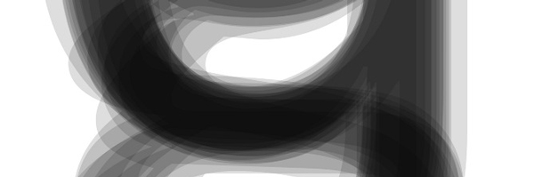
Images were created by overlaying glyph outlines of between 70 and 200 fonts, illustrating weight and width variants within the typeface families of interest. Dark areas show the regions that most of the investigated fonts have in common. Photo: Karin von Ompteda
Karin has just completed a project about the diversity of forms in commonly used text fonts. The visualisation explores variation in letterform across twenty of the most important sans serif and serif text typefaces. The images were created by overlaying glyph outlines of regular fonts and adjusting their opacity. The darker areas represent the degree of correspondence in form across the varying typeface designs.
Correspondence across typeface designs was quantified using a scientific imaging program which precisely calculates areas of darkness.

Karin von Ompteda
: Pubic Font, Meat Alphabet (2010)
Karin describes her growing passion for typefaces: “There is a moment in every designer’s life when you start to see letters in everything — like finding the face of Jesus in your toast.”
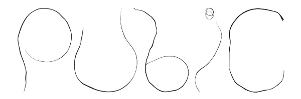
The design of this font is based on scanned unmodified pubic hair. It includes all letters, figures and a few punctuation marks. Photo: Karin von Ompteda.
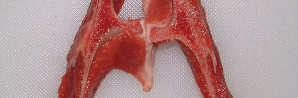
The meat font project was conceived walking home through China Town, where animal parts are on display in shop windows. Photo: Karin von Ompteda
Karin examined meat at a number of butchers and bought the cuts where the bones resembled letters. The final forms were then created by removing flesh or bone. Photographing the letters on a clean cutting board transformed the carnage into an alphabet.
Karin states “I suppose I am drawn toward the repulsive — there is a certain satisfaction in transforming something off-putting into something that people want to look at, and might even find aesthetic pleasure in.” (Thames & Hudson Blog)
She contributed to the contemporary lettering books Handmade Type Workshop (Charlotte Rivers, 2011, Thames & Hudson) and The 3D Type Book (Agathe Jacquillat and Tomi Vollauschek, Laurence King, 2011)
: Letter Fray, custom font (2008)
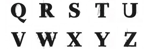
For Fortune Magazine an Alphabet was developed from laser-cut black linen. Photo: Karin von Ompteda
Fortune Magazine publishes a yearly special edition on contemporary fashion. For the 2008 edition they commissioned custom type that reflected the dark heavy feel of the season. The brief was met by reinterpreting Whitman, the magazine’s house font, in frayed laser-cut linen.
Individual letters were laser-cut from heavy black linen. Once the laser-cut process was complete, each letter was extracted from the surrounding linen, producing frays at areas of incomplete laser penetration. Letters were then positioned and scanned at a high resolution to be used in the publication, resulting in forms that were at home in Fortune Magazine – yet decidedly unique.
Only recently Letter Fray was included in the typographic magazine slanted, typographic experiments (15).

Bird’s-Eye, Photo: Karin von Ompteda
Karin’s illustrations and collages were published in a number of graphic and design magazines, such as Semi-Permanent, Coupe Magazine, The Walrus Magazine, Zeixs Illustration, Creative Quarterly, Applied Arts Magazine …
: Map of institutional partners of RCA, vizualization (2009)
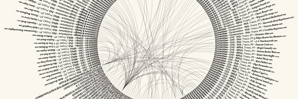
A visualization representing the 140 MPhil and PhDResearch students was commissioned by RCA as a large-format poster for its 2009 exhibition, and a condensed version for the exhibition catalogue. Photo: Karin von Ompteda
Karin examined the relationships of research students at the Royal College of Art to their funding agencies and institutional partners. The typographically-driven approach resulted in a functional piece that did not require a legend. The design process exploited the diversity of forms within Lineto’s Akkurat and Hoefler & Frere-Jones’ Didot typefaces to differentiate between the kinds of information chosen to represent each student.
: Oil and water, workshop critical visualization (2010)
Workshop presentation by by James Cadogan (Design Products) & Daniel Foster-Smith (Design Interactions). The oil represents the percentage of people who prioritise the economy, and the water represents the percentage who prioritise the environment. Photo: Karin von Ompteda
This project was aiming at visualizing data as a critical practice for design and art. Students explored the World Values Survey and integrated its data in visually told stories. The central challenge was to produce challenges to current thinking. The workshop intended to draw light on the contributions of artists and designer to visualize data thus evoking controversial discussions on subjectivity and aesthetics.
Karin remarked on the overall aim: “Ultimately, the final projects taken as a whole – employing the art and design arsenal of beauty, metaphor, emotion, humour, and narrative – will address the issue of what creatives bring to the field of data visualisation.”
The workshops were ran together with Peter Crnokrak (The Luxury of Protest) at the Royal College of Art and Sint-Lukas Brussels University College of Art and Design.
At TYPO London 2011 Karin, will take us to the place where natural sciences meet design. She will demonstrate how to fit in pattern and structures to an understanding of where we are and what we are doing.
Interested? Register now!


![TYPO London 2011 in retrospect [Update]](https://dqdzq01yr6ixf.cloudfront.net/uploads/2012/02/Typo_London_places.png)