


Lawrence Weiner comes trailing clouds of art world credibility. He is widely known as one of the luminaries of Conceptual Art — although he denies being a conceptual artist. His work attracts international acclamation. He is championed by powerful critics. Curators and institutions send out a message of cultural progressiveness by commissioning a Weiner art work (he calls them ‘sculptures’). He produces books, posters, films, music and public art in the form of installations and murals.
For graphic designers, Weiner’s work has a special fascination. His text-based ‘sculptures’, using enigmatic utterances rendered in immaculate typography, usually in capital letters and often utilising finely judged details such as brackets and rules, appeals directly to the aesthetic sensibilities of many designers. There’s a purity and primacy in Weiner’s work that many designers find utterly seductive and yearn to incorporate into their own labours, a feat which is rarely possible in commercial situations. For a certain sort of designer, Weiner gives credence to the notion that design can be art. Through his seemingly unrestricted use of type, line, colour and space, he confirms that when used without commercial constraint or the need to convey a client’s message, these basic building blocks of graphic communication can be transmuted into art.

Lawrence Weiner
However, there’s one question all graphic designers ask themselves in response to Weiner’s work: why is he using the conventions and mechanics of graphic design to create art? Why does he use them, with their inherent limitations, when he is free to use any form of visual expression whatsoever? Weiner ticks most of the boxes to qualify for membership of the graphic design club. His use of type is technically and aesthetically accomplished, and his ability to create spatial tension through the placement of graphic elements evokes thoughts of the great Constructivists (Weiner is an admirer of El Lizzitsky — although you’d never confuse his work with Constructivism). He has created his own typeface (Margaret Seaworthy Gothic1) and modified others. He is a graphic designer in nearly every respect, except one: he’s not a graphic designer.
Weiner began by chalking texts onto walls: but he soon graduated to using formal, if highly idiosyncratic typographic configurations. Why did he do this? There’s plenty of writing about Weiner, but not much about his relationship with graphic design. Art critics gloss over his yoking of conceptual art and graphic design: his use of graphic design conventions appears to be a subject hardly worth mentioning. A lengthy and thoughtful article in Eye (no.29)2 by Russell Holmes, himself a designer, went some way towards explaining Weiner to a design audience. Holmes sees a clear link between Weiner’s use of graphic design and the work of other Conceptualists:
“The period when [Weiner] first began to use text in his work was at the point when artists, in America especially, began to question the nature of art and in particular the nature of the two disciplines which formed the basis of contemporary art practice — painting and sculpture. Weiner points to work of contemporaries such as Dan Flavin and Carl Andre, noting that once we accept that strip lighting can be painting, or a pile of bricks sculpture, then it is also conceptually possible for us to accept language as just another medium which can be used as material for sculpture.”
Has Weiner merely appropriated graphic design in the way that Flavin and Andre adopted strip lighting and bricks? Perhaps, but it seems to be an appropriation of a different kind. Weiner’s work requires a level of craftsmanship and construction that is not often found in Conceptual Art. In his case, there appears to be a deeper motivation. If we turn to Weiner’s writings and interviews (Having Been Said, Writings & Interviews of Lawrence Weiner 1968–2003, is a good starting point3) we are confronted by another enigma. Weiner has plenty to say: aphorisms and epigrams flow freely and seductively from him. But these utterances veer between the convoluted and the lucid: between the incomprehensible and the comprehensible. You can’t always be sure what he means, either in his work or in his proclamations.
A case in point is his famous 1969 Declaration of Intent, a statement he stands by today:
1 — The artist may construct the work.
2 — The work may be fabricated.
3 — The work need not be built.
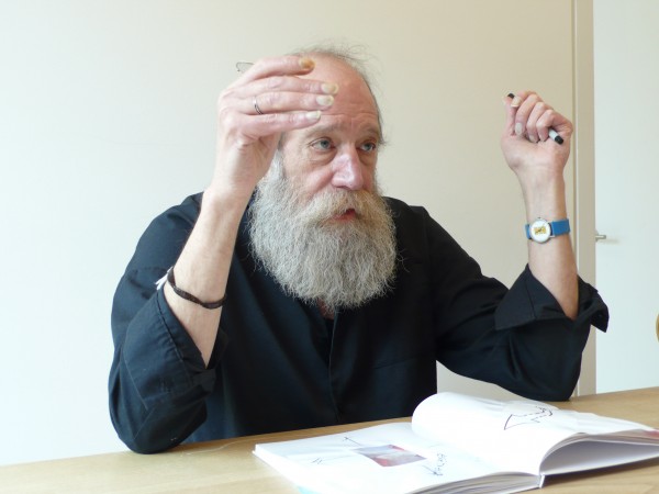
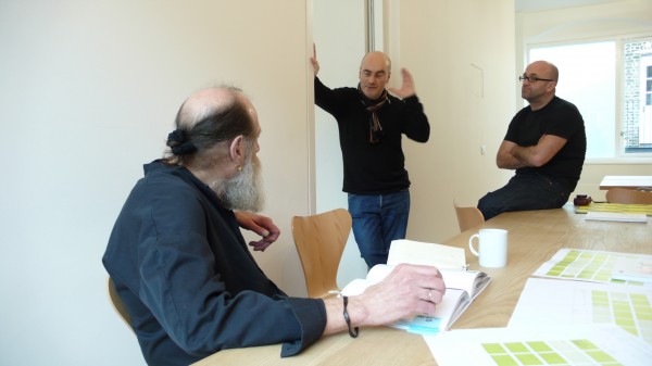
On the surface, this couldn’t be clearer. It seems to be a master code for Conceptual Art. But is it a code Weiner adheres to? The sheer amount of his ‘built’ work seems to contradict his point 3. For Weiner, it appears that the work does need to be built. On a rainy day in March I went to meet Weiner in Jonathan Ellery’s East London studio. I’d met him before in Berlin, and I’d started to quiz him on his use of Franklin Gothic Bold Condensed, but before he could answer he was whisked away by two earnest looking women who clearly had more important plans for him than allowing him to chat about typefaces. My question was left hanging in the Berlin night. This time I was determined to push him as far as I could on his relationship with graphic design. I wanted to find out what drew Weiner to the conventions of design.
Weiner is invigorating company. He is not in the least pretentious, and is happy to joke and gossip and discuss his love of strong whisky. Repeatedly, sitting around a table with the page plans of this book spread out before us, he reiterates his intention to make the book “a collaboration”. It’s rare to find this degree of willingness to share a creative platform, especially from an artist of Weiner’s status; it’s an unmistakable sign of his fundamental decency and inner confidence — only the second-rate fear creative collaboration.
But did I manage to pin him down? Did I get him to explain his use of graphic design? I’ll let you decide.
AS — Are you aware of the formal rules of typography?
LW — I’ve come across them and I’ve picked up on them, very much like you pick up a language on the street — after a while you begin to understand the grammar whether you want to or not. I became fascinated with it, by children’s books, but I haven’t studied it, it was all haphazard. I studied philosophy because I was at a time when all the art things that were being offered were being done by failed Abstract Expressionists, nice people, well meaning. But I was a loudmouth kid, and one thing I knew was that if you put me in a room and told me to express myself, I knew how empty the inside was, I was smart, and rage is not something that makes art, anger does. You can only be angry when you understand the situation; otherwise it’s just a futile rage.
AS — Did you draw as a child?
LW — Not any more than anybody else.
AS — So how did you end up as an artist? Didn’t you want to become a philosopher?
LW — That was always a joke. Yes, I studied philosophy with rather nice people, I was very young, and it was during the McCarthy era. I went to a High School, which was one of the special schools. And at night I would work at the docks, and ended up in bars where I met people, and these people listened to me because I was interested in a lot of things. I don’t know where they got the patience to listen to this 14 year old, but they did.
New York was a very open city, and they’d let kids into the jazz clubs. I began to listen to people talking, and I started to discover the Museum of Modern Art. They’d given out passes to kids in school to go to the Museum. You could pick up a girl, and not only have sex but have someone to talk to — as opposed to the South Bronx, where I was growing up, where you could have all the sex you wanted but you really wouldn’t do much talking. That’s the only thing I ever learned from my mother, maybe that’s what made me become an artist, do anything you want, she said, but remember, you have to have breakfast with them.
AS — Good advice, I’ll remember that. There are a few examples of designers who’ve pretty much ripped you off and taken what you’ve done and used it in a commercial setting. In most cases this has been done respectfully, but how do you feel about seeing your work appropriated like this?
LW — I would like to go on record and say that the reason I’m making these things is for people to use. But yes, I have had situations where I’m sitting there and wondering why someone is reaping the rewards for something that I did. I’m looking at it and I know it was me, but there’s no way to say it. It wasn’t until Eye magazine did that spread that there was some kind of tacit agreement that maybe this had been going on. When I got the Singer prize4 it was the same thing, I couldn’t figure it all out, where did I fit in? I realized this gave them the legitimacy to steal anything they wanted, and re-use it and do anything they wanted with it. This just made you into a public resource. I never copyrighted anything, and I don’t copyright a piece of sculpture, I don’t copyright my work, if it’s worth stealing it’s worth buying. No, I’m very serious. But yeah, I’m aware of it. I don’t know how it makes me feel, but I’m aware of it.
AS — At the Graphic Europe5 conference you were in the audience for most of the talks. What did you make of three days of graphic design chatter?
LW — I was really majorly disappointed. There was very little talk about design, there was very little talk about aspirations, it was much more about anecdotes, and at the same time slipping in clients and using venues as some sort of cloak to give you a certain position. Whereas most of the people who were there were accomplished in their lives, but they never talked about what they had accomplished, they never talked about why that line was such, and they never thought about how it was going to affect those people who saw it on the street.
AS — You have written that you see almost everything you do as a poster?
LW — All work is a poster, or a painting, it’s a means of putting up a logic system, an intellectual idea, that other people can grasp it in one particular thing, they don’t have to read the book to see it. And that’s what good design is, and what a good poster is. When I was speaking with Jonathan [Ellery] I began to realize that all art, based on objects, is sensual. And design, by its nature, is visceral. And visceral and sensual are not the same thing. When you choose to make design, you’re choosing to be able to deal with what you understand about sensuality and what you understand about so-called politics and make it visceral. But art does not have to be visceral, art just has to present itself very quietly.
AS — So is your work sensual or visceral?
LW — I would hope sensual. Sensuality is to elevate that moment where somebody realizes the fact, the relationship, when it touches. When somebody looks at a piece of stone or a piece of wood and realizes its relation to themselves, that’s sensuality. It’s the same as when you fall in love, you’re with somebody and you realize it, you’re really spending a lot of time looking right here. And that’s it, that’s the thing that every time you look at the person, it pleases you, that’s sensual.
AS — Why Franklin Gothic Bold Condensed?
LW — I hated Helvetica. Franklin Gothic was my concept, something elegant and beautiful that had no authority. That was it. And it was also quite easily available. Remember in the early days, each one of those pieces that was put up was put up with paint, and stencilled out with individual letters. This was before the days of being able to have it all set out.
AS — I want to talk about text and language, because that’s where you start isn’t it? You start with the words.
LW — I start with materials. And I translate them into a language. Language is read as text… I start with the relationship of the materials. I translate it and then clean it up.
AS — Is that what you’re doing with this book?
LW — No, this book, Turning Some Pages, is something different, I want this book to be something that somebody has as a journal. So essentially you are — and I hate the word — inspiring somebody who gets this book to look at somebody’s musings. It’s all musings about design that I’ll put in; I’ll show off my Margaret Seaworthy Gothic letters which I’m very proud of. They’ll just run on a page without an explanation.
And then I’m trying to inspire someone to use the note pages that we’re providing them with, to make notes about something rather than just appointments. That’s how it is, I basically read these things as an adolescent, and then, if you’re good at what you do, you treat everyone as if they are a talented adolescent, which means you try to win their hearts and minds without telling them you’re doing it, without offering them anything they can associate with something that turned them on, by doing something that’s as good rather than as it is. It’s all very idealistic, but it often does work though.
AS — What do you mean by this?
LW — You see that’s maybe the difference between an artist and a designer. A designer is aware that they’re doing it for a client, for a viewer; the artist forgets the fact that you make art for other people, you don’t have to make it, you have to make it so that somebody else will see it.
AS — So, are you still a conceptual artist then?
LW — Never was.
AS — What do you think conceptual art is?
LW — I have no idea. I think what they were trying to do was to take people who don’t know things about art, what the lifestyle of art is, and they thought that the conversation about art constituted art. No, it’s a conversation about art in the society and perhaps an important conversation, but it is not a substitution for art. The theoretical good of Albert Schweitzer does not preclude having to know about penicillin.
AS — In 1969, you made your famous declaration of intent. To my mind it reads as a wonderful definition of conceptual art. Do you still stand by it?
LW — It was printed in 1969, but it was really from 1968. Yes, I still stand by it and I don’t think it has anything to do with so-called Conceptual Art. It has to do with how you can use something that somebody is putting out into the world that has never existed before. Now I don’t like to have instructions, I like to make things that don’t need instructions once it’s entered into the world. The misunderstanding and the understanding are just the same. You put something out that hadn’t functioned before, didn’t exist before, perhaps. People were having a lot of trouble, they wanted to use what I was presenting, but they didn’t quite know how. I made it clear that there was no way to do it, that if they could find use for it in its form that was fine, that was it. It’s a very simple, American, socialist standard of “this is what constitutes art”. As opposed to, ‘art is…’.
AS — How would you describe yourself now?
LW — I’m still what I am, a sculptor.
Notes
1. Margaret Seaworthy Gothic, a typeface designed byLawrence Weiner.
2. The Work Must be Read by Russell Holmes, Eye 29, Vol. 8, Autumn 1998.
3. Having Been Said, Writings & Interviews of Lawrence Weiner 1968–2003, Hatje Cantz Publishers, 2004.
4. Singer Prize, Singer Museum, Laren, The Netherlands, 1988.
5. Graphic Europe 2004, Berlin, October 2004.
TYPO London wishes to thank Jonathan Ellery for making the re-publication of this article possible. Photography by Caroline de Vries at Browns.
May 2007 © Lawrence Weiner
May 2007 © Howard Smith Paper
May 2007 © Browns
Lawrence Weiner
Lawrence Weiner at Browns
Lawrence Weiner, Adrian Shaughnessy and Jonathan Ellery


